Hey folks,
Here’s a case study on Mokobara, we hope you have a good read!
The Setup
Once upon a time, in a world full of broken zippers, airport-induced rage, and sad black bags that looked like they were designed by a depressed potato, a new player rolled in — Mokobara. Founded with one simple (but painfully relatable) insight: luggage is ugly, stressful, and nobody’s doing it right.
Enter Mokobara — the cool kid on the baggage carousel. Where others gave you stress, they gave you pastel. Where others gave you “sir, is this your bag?” confusion, they gave you design so sexy the TSA would swipe right.
The Product Philosophy: Look good, feel better, pack best
Mokobara wasn’t trying to reinvent the wheel. Just the wheels on your suitcase.
The vibe? “What if Apple, Muji, and Virgil Abloh had a baby... and that baby carried your socks?”
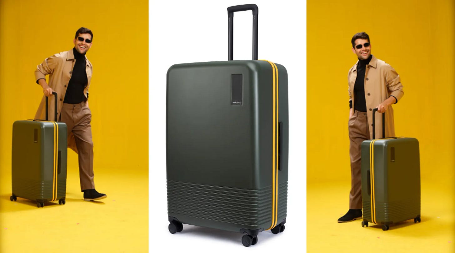
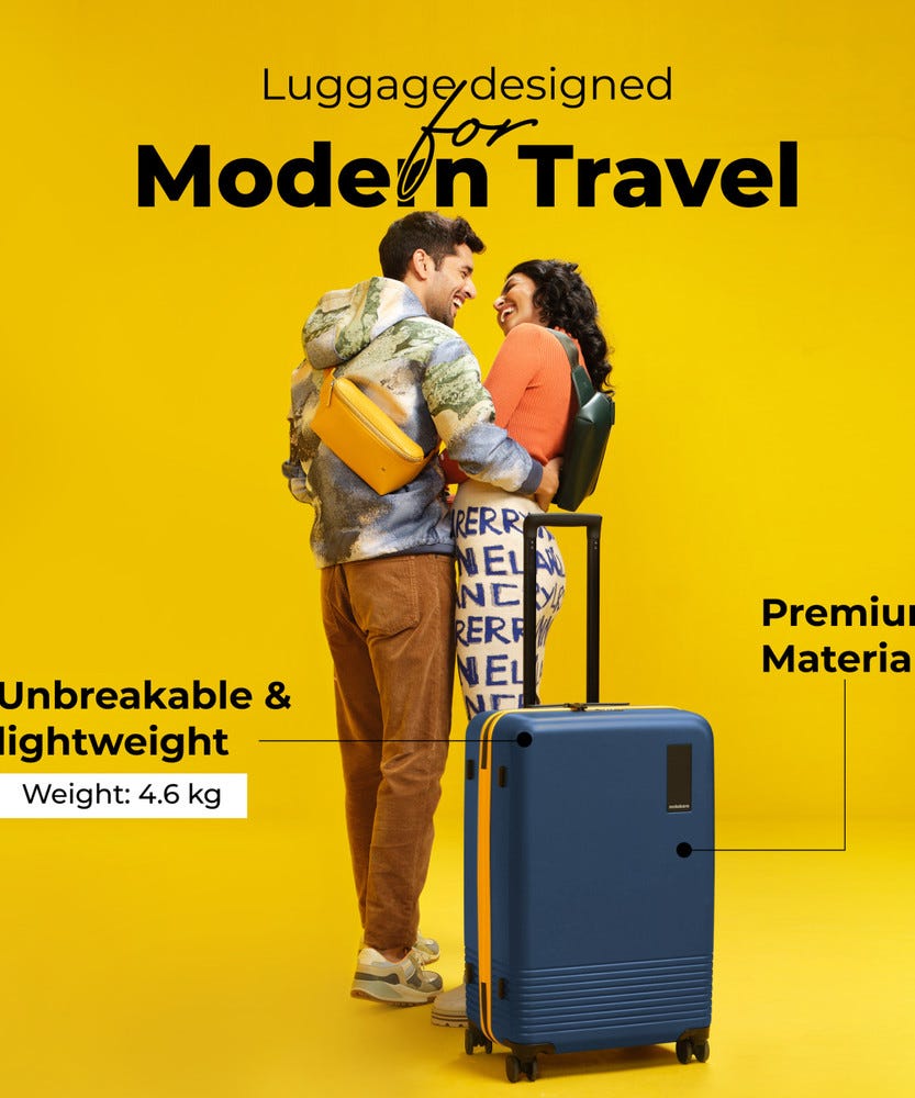
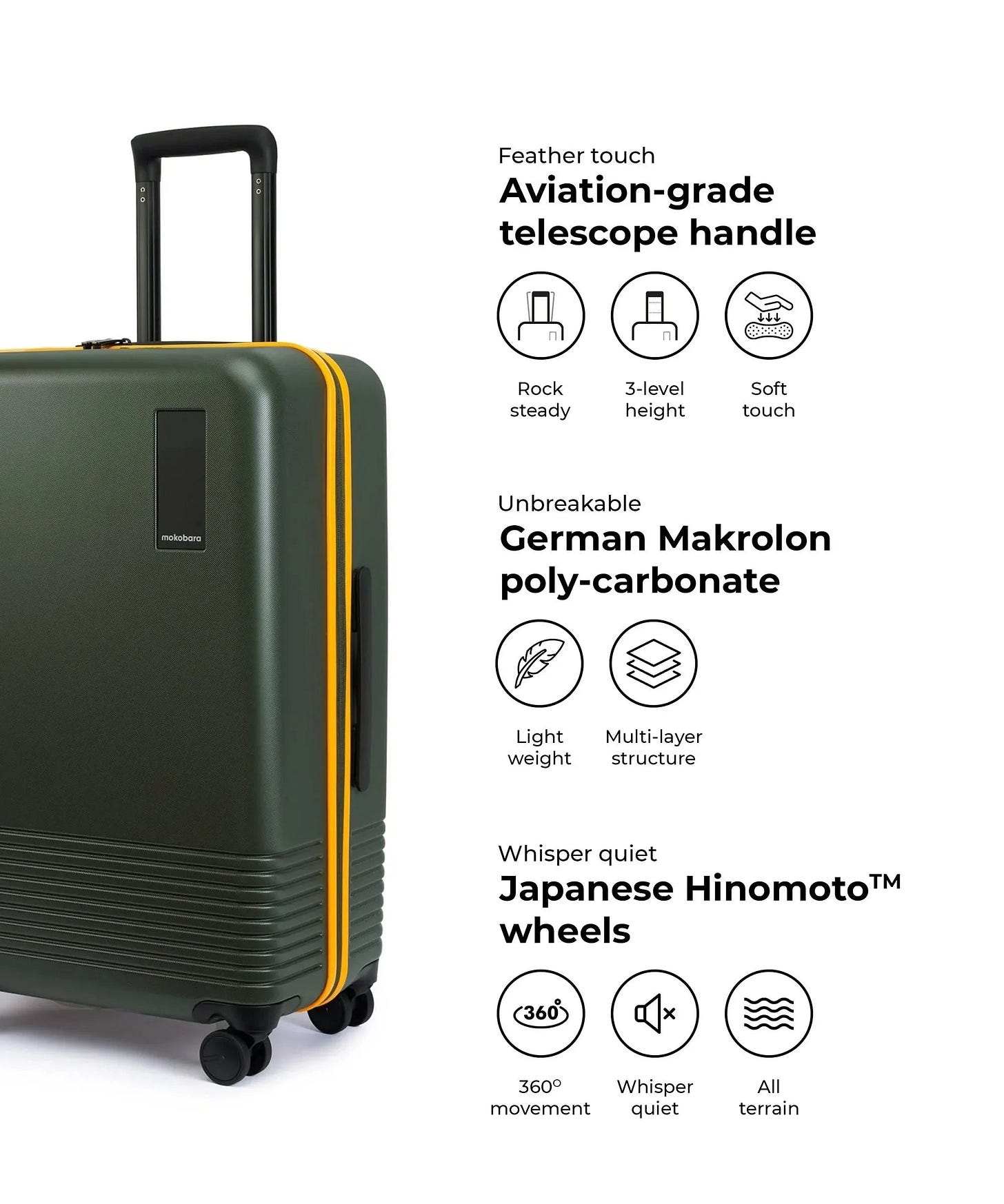
Their design language is minimal, premium, and very "Instagram in Bali." With features like:
Unbreakable polycarbonate shells (we dare you, Air India)
TSA-approved locks (for when your laptop bag is your office)
Compression systems (because yes, 17 outfits is reasonable for a weekend)
Color names like “Lush Lilac” and “Stormy Blue” (no “charcoal grey #47” here)
Brand Positioning: More than luggage. It’s a lifestyle flex.
Mokobara doesn’t just sell bags. They sell vibes. Their marketing screams:
“You’re going places.”
“You’re organized, stylish, and probably drink cold brew.”
“You will definitely not lose a sock again. Probably.”
From D2C beginnings, Mokobara leaned hard into:
Content with a sense of humor (quirky copy > boring features)
Slick packaging that makes unboxing feel like an Apple product launch
Influencer tie-ups that scream aspirational but still relatable (read: influencers who look cool but still eat pani puri)
What They Got Right
✅ Aspirational + Functional — Made people want to spend ₹10K on a suitcase
✅ Obsessed with UX — From wheels to website, it’s all buttery smooth
✅ Brand voice that actually has a pulse — Witty, warm, non-robotic
✅ Designed for the modern Indian traveler — Not for some hypothetical Swiss banker, but for Neha going to Goa and Arjun on a 3-day work trip to HyderabadChallenges (a.k.a turbulence):
Premium pricing in a price-sensitive market — You gotta convince aunties and uncles this isn’t “just a suitcase”
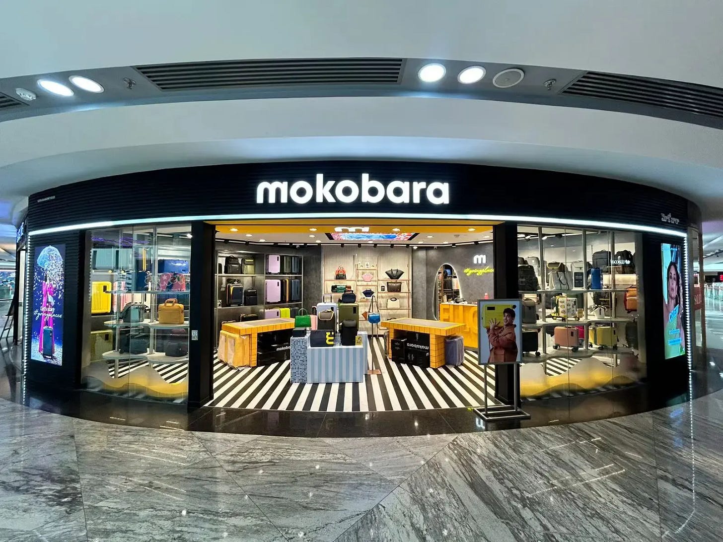
Offline experience — You can’t touch and feel polycarbonate online (unless you lick your screen, which we do not recommend)
Competition heating up — American Tourister and Samsonite woke up and chose “millennial pastels” too
The Takeaway
Mokobara is what happens when you mix design thinking with a dash of millennial chaos, a splash of Gen Z aesthetic, and a refusal to accept that all luggage must be boring and black.
Their journey shows that even in something as uncool as luggage, there’s room for innovation, storytelling, and a little sass.
They didn’t just build a brand.
They made packing feel like self-care.


